Has the task of designing the company sign fallen to you? Whether you’re the boss trying to take care of things yourself or you just drew the short straw, teaching yourself graphic design is not an overnight process. That being said, you can still come up with a great starting point for your sign fabricator without going to art school. We’ve broken down how to design the sign you want into just three steps.
1. Writing the Copy
The first step is figuring out exactly what your sign needs to say. Often, you won’t need anything more than the company name. But what if you need a tagline? If your company doesn’t have an official slogan, it’s time to go over the website and any ads that may already exist. If you spot a catchy line, try it out. Taglines are made through repetition.
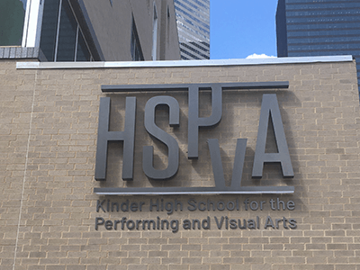
If you need to develop a tagline completely from scratch, don’t worry about trying to be too clever. Many businesses prefer a concise description of what they do. Take a look at the above photo for a good example from HSPVA. Remember: people will debate creative writing all day, but it’s hard to argue with a simple description.
2. Choosing Your Font and Colors
Now that you know what your sign will say, it’s time to make some choices about the visuals. The easiest and best choice for fonts is to stick with the one that your logo is already using. If that’s not a good option for you, try using a common, readable font like Arial, Garamond, or Verdana. These are timeless choices that go with just about anything.
If your sign is going to be in color, use your logo as a guide. Deciding which colors go together well can be more difficult than it looks, so go with what designers call a monochromatic color scheme. For example, if your company logo uses green, consider using that or another shade of green for a simple border or your tagline.
3. Putting it All Together
Now that you’ve got all of your elements ready to go, it’s time to design the actual sign. It can be very helpful, especially for beginning designers, to use a photo of the sign’s eventual home as your background. This will help you imagine your design in the proper context.
While there’s nothing wrong with simply placing your logo in the center with the tagline just beneath it, you might want to do something a little more creative. If your logo (or the company) is new, you might have some luck changing it up just a bit. Look at the HSPVA logo again. The P and the V have been shifted up and down. The name is still perfectly legible, but that design touch helps convey the creativity that the school is known for.
We’re Here to Help
Whether you’re designing the sign yourself or you’d like the services of a professional, our team at National Signs can help you bring your design to life. Browse our gallery for some creative ideas, then contact us to design the sign of your dreams.