Businesses rely on signs to identify their business, highlight specific areas and spaces, and help provide direction and guidance to visitors. However, business signs must also be inclusive to those with disabilities to ensure the building is accessible, safe, and welcoming for them, too.
The Americans with Disabilities Act (ADA) is a law that protects people with disabilities by ensuring they have the same access as everyone else to goods and services, job opportunities, government services and programs, and safe navigation in public spaces. Because of this law, companies have to meet specific standards for accessible sign design so that everyone can clearly see or understand all their sign information.
Let’s look at what types of business signs need to be ADA compliant signs and how the law impacts sign design, specifically with ADA signage color contrast requirements and light reflection.
What Signs Must Be ADA Compliant?
Any public building or public space is required to have ADA signage so that anyone, regardless of visual or sensory impairment, can read and understand important signs when they’re inside or outside the building. Examples of signs that should be ADA compliant are:
- Wayfinding signage such as floor levels, staircases, and exits
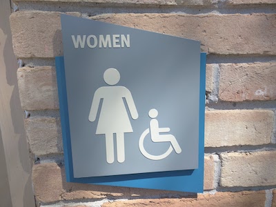
- Restroom signs
- Elevator and escalator signs
- Every permanent room, such as a dining area, conference room, or storage room
What Are ADA Standards for Accessible Signs?
The ADA sign regulations for compliant business signs involve four specific areas: color contrast, tactile characters, light reflection and glare, and font size and spacing.
- Color Contrast – ADA signage color contrast requirements state that signs must have a recommended 70% contrast between the background color and characters or letters. This means that the signs can be in any color combination as long as those two colors are light and dark and contrast each other by at least 70%. Having light characters and dark backgrounds makes it more likely to see business signs easily.
- Tactile Characters – In addition to color contrast requirements, ADA compliant signs should also have tactile characters and pictograms so those with visual impairments can feel them. Characters and pictograms can be raised or subsurface, so they stand out better against the contrasting background. Signs should also be in Braille for those who need information or wayfinding directions in tactile letters.
- Light Reflection and Glare – The most recent 2010 ADA standards also require that signs be made of non-reflective materials to minimize glare. Both characters and the background of signs should have a non-glare finish to enhance their visibility and readability for those who are visually impaired.
- Font Size and Spacing – The ADA has also set sign regulations for the fonts used on signs to ensure they are clear and easily readable. ADA compliant signs must be in Sans Serif fonts in uppercase text for tactile characters, and lowercase letters for Braille.
In addition, all characters and letters must be between 5/8 and 2 inches tall and must be within ADA guidelines for width and character spacing from each other. There are also mounting guidelines for ADA signage to ensure they are visible to those in wheelchairs or at lower heights, and this helps ensure that everyone can read the signs posted.
How National Signs Can Help
Business signs can be informational, wayfinding, or welcoming, but above all, they should be accessible to every person who enters a public space. National Signs offers a wide range of signs that clearly identify important areas of buildings while also meeting ADA regulations on color contrast requirements, font and spacing, mounting guidelines, and light reflection. Contact us today to learn more about our ADA signage options for your business today!