Sign, sign, everywhere a sign. We pass them every day by the hundreds, but have you ever wondered why some of them stand out more than others or what goes into their construction?
Today we thought we’d take you on a trip behind the scenes of the sign design and fabrication world to look at some of the tricks of our trade. While some of the items on this list are just fun bits of trivia, others can actually help you improve your messaging.
1. The Power of Borders
Is your sign in a high-speed, high-traffic area such as near a highway? These spots can be great for getting a lot of views, but you’ll also need some special considerations to make sure drivers don’t miss your message.
The secret? Borders.
It may seem overly simple, but a simple border like a white rectangle around your text helps focus the reader. Signs with borders allow for an increase in reading speed of up to 26%.
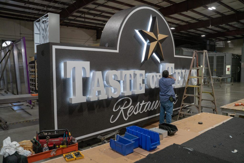
2. Eco-friendly Lights
You may have heard that LED lights are better for the environment, but did you know that they’re better for your business too?
Compared to ordinary incandescent lights, LED lights use as much as 75% less energy and last 25 times longer. They can also be seen from farther away and in poor weather conditions because they’re far brighter. When it comes to LEDs, helping the environment helps your bottom line.
3. What NOT to Put on Your Sign
It can be very tempting to put as much information as possible on your signage. After all, if you’re investing in outdoor advertising, you want to get your money’s worth. However, there are a few things that a good designer will try to dissuade you from including.
The primary culprits are telephone numbers and website addresses. Think about the last time you drove past a billboard and wrote down the phone number. Never, right? It isn’t practical or safe, and you’re not going to remember the number either. So save your sign space to make sure viewers remember your name and your message.
4. High-tech Solution for ADA Signs
Signs may have started carved from wood or chiseled from stone, but we’ve come a long way since then. These days, we work with everything from metal, to plastic, to computer-driven lasers.
Laser technology is helpful for several parts of the fabrication process, including the creation of Braille lettering for ADA compliant signs. If only those long-ago signmakers could see us now!
5. Blank Space Isn’t Wasted Space
First-time designers often try to completely fill up their signs with logos, contact information, and pictures. Filling that blank space is their job, right? Not necessarily.
The more elements you add to your sign, the weaker each element becomes. When a viewer drives past, they only have about three seconds to take in your message. If you’ve got too much going on, they won’t take in anything at all.
A good guideline for experienced designers is to leave about 40% of the space blank. This helps to focus the viewer on the elements that truly matter.
6. Direction Matters
No matter what you do, the sun is eventually going to get to your sign. Your colors will lose their brightness, the text will lose its sharpness, and your pictures will fade. You can slow the process way down with things like laminate, but if you give the sun enough time, it’s going to win.
There is one trick that can help extend your time between maintenance visits that many people don’t know. If you have any control over which direction your sign faces, make sure it isn’t… south.
Why south? Everyone knows the sun rises in the east and sets in the west, but signs facing south are hit with UV rays all day, including the strongest rays at midday that an east or west-facing sign won’t get.
7. Turn Off the CAPS LOCK KEY
Here’s a final tip from our design team: Don’t put your message in all caps. Caps are fine for your logo, especially if your company’s name isn’t that long. However, using all capital letters for the rest of your message isn’t nearly as effective as you might think.
We understand the instinct. You want to make a bold statement, and everyone knows that all caps are the text equivalent of shouting. The problem is that it’s harder to read. Your eyes really appreciate the hills and valleys of both upper and lower case letters, so don’t take it away if you don’t have to.
Want to Learn More?
When it comes to graphic design standards and sign fabrication techniques, we could go on for days. Our expert sign design and fabrication teams have been doing this for decades, and they’re ready to put these and every other skill they’ve learned to work for you.
If we’ve got you interested in our fabrication process, it’s time to learn more.